Introduction
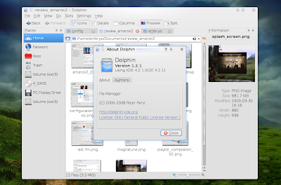
Dolphin was intended to replace Konqueror as the default file manager in KDE 4. The scope of Dolphin was to only provide a compact and easy-to-use file manager, without all the features and uses Konqueror has. And (I think) it succeeded. In the beginning most of the users were reticent regarding this idea, since Konqueror provided anything one could possibly ask from a file manager. Besides, most KDE fans thought Dolphin looks too much like with Nautilus and may be limited regarding usability and configuration. However, I see in Dolphin an appropriate manager for day-to-day use.

Interface
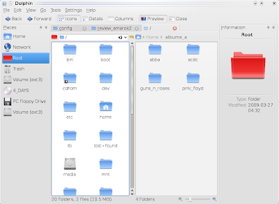
Dolphin is split in three main components (except for the menubar and toolbar). The first one would be the Places widget, located by default to the left, and containing shortcuts to the most important places like home directory, root, trash, and mounted devices. The center is occupied with the file browser, while to the right there is the file information widget. The good thing is that the Places and Information widgets can be moved and grouped wherever one likes. Another plus is the way the icons in the Places tab resize depending on the tab's width.
Features
Dolphin comes with tab support (the usual CTRL+T and CTRL+N shortcuts by default, also the KDE-specific CTRL+, and CTRL+. for switching to the previous and, respectively, next tab). Although not visible by default, the location bar can be shown using the standard CTRL+L shortcut.
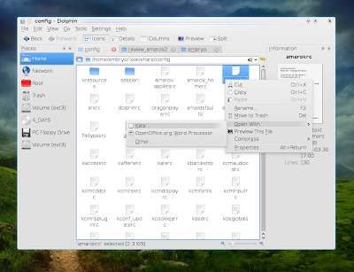
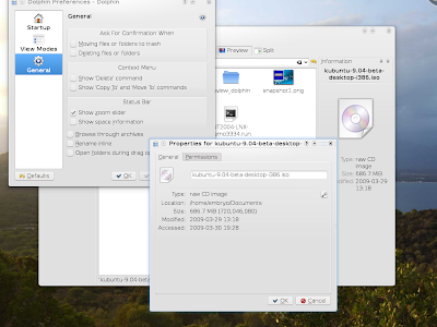
Regarding configuration, Dolphin offers all the necessary and specific options for a regular file manager: from sorting files by name, size, date, type etc to file previews, a huge number of zoom levels for icons (with a zoom slider which can be shown or hidden via Settings -> Configure Dolphin -> General tab), the ability to browse through archives (by embedding Ark) and several more. It allows three view modes for files: icons, details and columns, and it also includes the option to split tabs vertically (left/right). Basically, all the important features in Konqueror's file manager can be found in Dolphin too.
As in every standard KDE application, you can configure the shortcuts in the Settings -> Configure shortcuts menu option.
If you miss buttons like Up (Alt+Up) or Zoom In/Out from the toolbar, you can add these by right-clicking on the toolbar and going to the Configure Toolbars... option.
Conclusion
Since my main system is Debian Lenny (KDE3) I must say I did not have much time to test KDE4 (although lately I spent some time with Kubuntu Jaunty Beta), but I was impressed in a pleasant way by Dolphin. What I've read before was mostly how crappy of a file manager it is, how limited it is and so on. Although I prefer Konqueror, I must say this isn't true: Dolphin is actually pretty feature-complete and easy to use.
It's true that once you get used in Konqueror, for example, to open pictures, text files etc. in a new tab, it will be hard to get unused to this when in Dolphin. But Dolphin's purpose is not to be Konqueror and that's it. And it is not so 'basic' and tiny as some make it look. In time, it will probably become the file manager of choice for the majority of KDE4 users (if not already).
Do you use Dolphin on a daily basis? Do you prefer it over Konqueror or use another file manager in KDE4? Please share it in the comments below.
HomepageSource URL: http://ashesgarrett.blogspot.com/2009/03/review-dolphin-121-file-manager.html
Visit ashes garrett for Daily Updated Hairstyles Collection
Dolphin was intended to replace Konqueror as the default file manager in KDE 4. The scope of Dolphin was to only provide a compact and easy-to-use file manager, without all the features and uses Konqueror has. And (I think) it succeeded. In the beginning most of the users were reticent regarding this idea, since Konqueror provided anything one could possibly ask from a file manager. Besides, most KDE fans thought Dolphin looks too much like with Nautilus and may be limited regarding usability and configuration. However, I see in Dolphin an appropriate manager for day-to-day use.

Interface
Dolphin is split in three main components (except for the menubar and toolbar). The first one would be the Places widget, located by default to the left, and containing shortcuts to the most important places like home directory, root, trash, and mounted devices. The center is occupied with the file browser, while to the right there is the file information widget. The good thing is that the Places and Information widgets can be moved and grouped wherever one likes. Another plus is the way the icons in the Places tab resize depending on the tab's width.
Features
Dolphin comes with tab support (the usual CTRL+T and CTRL+N shortcuts by default, also the KDE-specific CTRL+, and CTRL+. for switching to the previous and, respectively, next tab). Although not visible by default, the location bar can be shown using the standard CTRL+L shortcut.

Regarding configuration, Dolphin offers all the necessary and specific options for a regular file manager: from sorting files by name, size, date, type etc to file previews, a huge number of zoom levels for icons (with a zoom slider which can be shown or hidden via Settings -> Configure Dolphin -> General tab), the ability to browse through archives (by embedding Ark) and several more. It allows three view modes for files: icons, details and columns, and it also includes the option to split tabs vertically (left/right). Basically, all the important features in Konqueror's file manager can be found in Dolphin too.
Split left/right

As in every standard KDE application, you can configure the shortcuts in the Settings -> Configure shortcuts menu option.
If you miss buttons like Up (Alt+Up) or Zoom In/Out from the toolbar, you can add these by right-clicking on the toolbar and going to the Configure Toolbars... option.
Conclusion
Since my main system is Debian Lenny (KDE3) I must say I did not have much time to test KDE4 (although lately I spent some time with Kubuntu Jaunty Beta), but I was impressed in a pleasant way by Dolphin. What I've read before was mostly how crappy of a file manager it is, how limited it is and so on. Although I prefer Konqueror, I must say this isn't true: Dolphin is actually pretty feature-complete and easy to use.

It's true that once you get used in Konqueror, for example, to open pictures, text files etc. in a new tab, it will be hard to get unused to this when in Dolphin. But Dolphin's purpose is not to be Konqueror and that's it. And it is not so 'basic' and tiny as some make it look. In time, it will probably become the file manager of choice for the majority of KDE4 users (if not already).
About

Do you use Dolphin on a daily basis? Do you prefer it over Konqueror or use another file manager in KDE4? Please share it in the comments below.
HomepageSource URL: http://ashesgarrett.blogspot.com/2009/03/review-dolphin-121-file-manager.html
Visit ashes garrett for Daily Updated Hairstyles Collection


